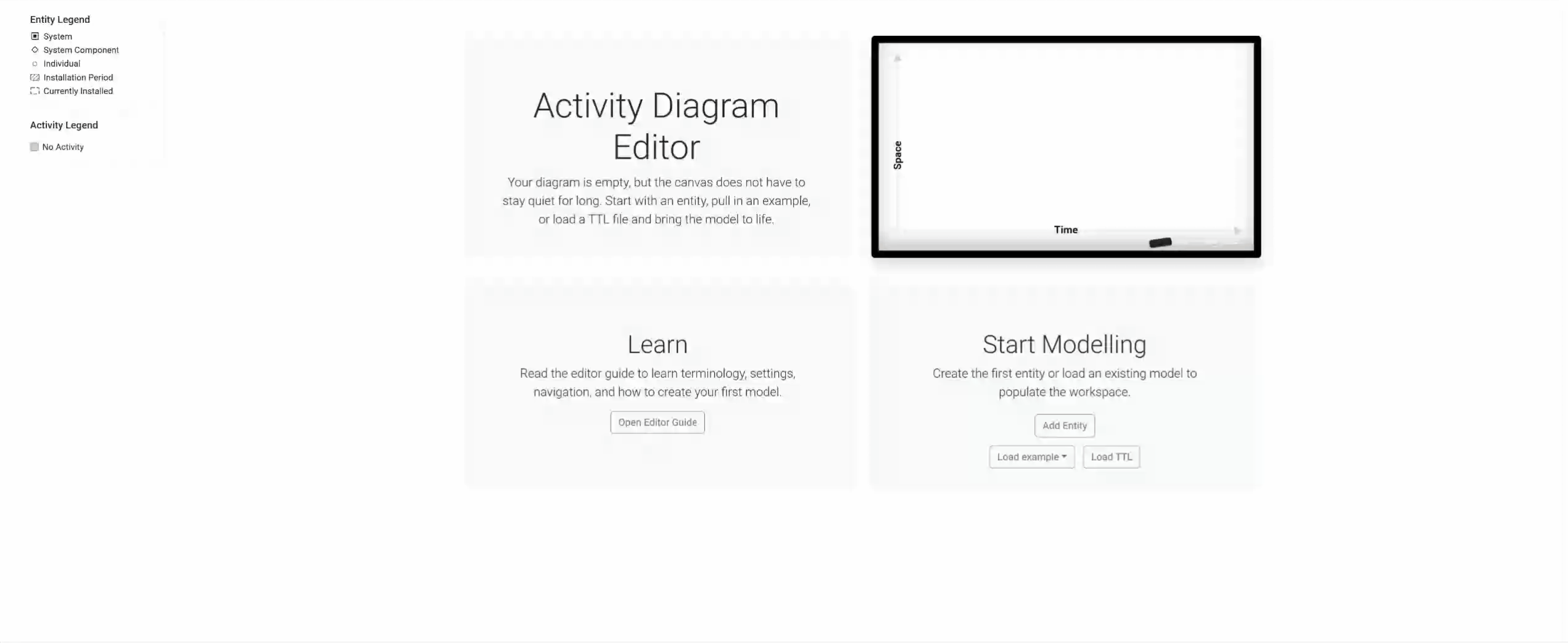
The Activity Diagram Editor is a browser-based tool for creating, viewing and editing 4D activity diagrams. These diagrams plot activities against time along the horizontal axis and participating entities along the vertical axis, showing at a glance which entities are involved in which activities and when.
This guide walks through every feature of the editor, from creating your first entity all the way to customising the diagram layout and exporting results. Each section below explains a single capability with step-by-step instructions.
Before starting, you may also want to review the core concepts.
View Terminology Guide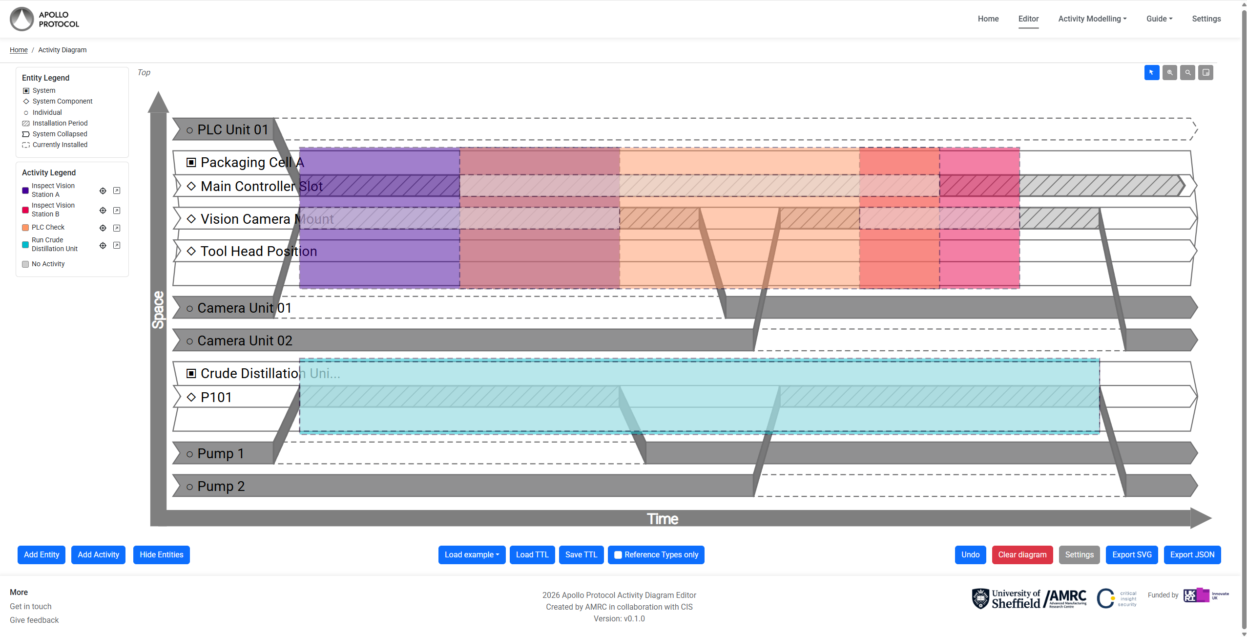
Creation and Editing Diagrams
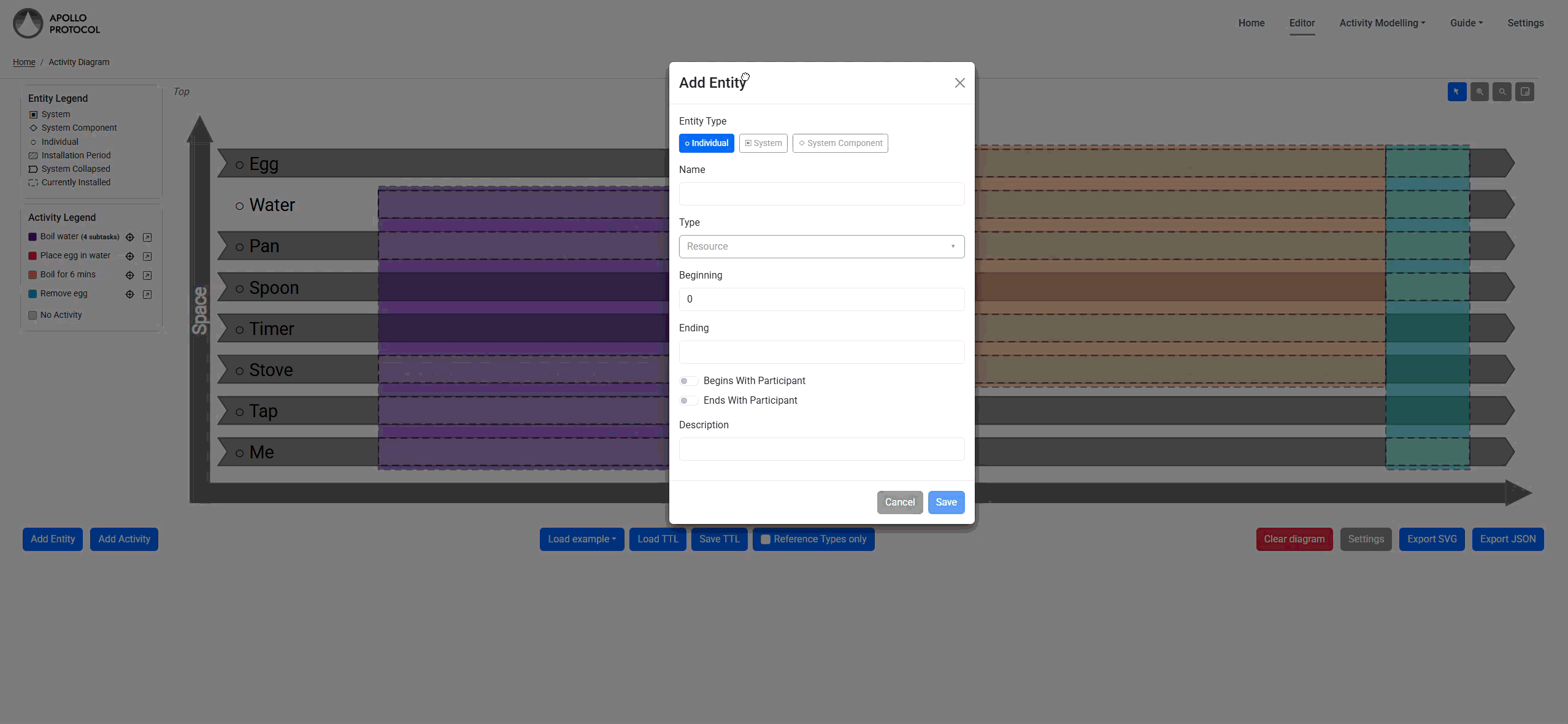
Adding Entities
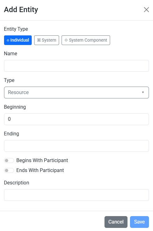
Entities represent the physical or conceptual objects that participate in activities. To add one, open the Add Entity panel, set a name and time bounds, optionally choose a type, then press Add.
Entities appear as rows on the vertical axis. You can categorize them using types to support downstream analysis and consistent modeling.
The entity type is set once and cannot be changed after creation. Each type determines which additional controls are available in the entity editor (for example, system components show a “Component Of” dropdown, and individuals show the Installations panel).
Type Editing
Entity and activity types can be created, selected and renamed directly from the type controls. These types help keep your model semantically consistent.
Begins / Ends With Participant
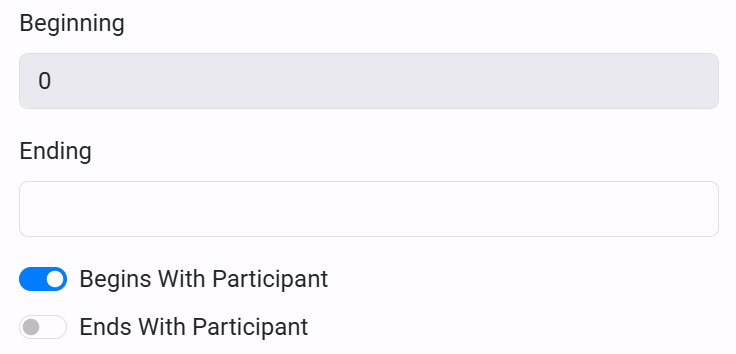
When editing an Individual, two toggle switches appear next to the time-bound fields: Begins With Participant and Ends With Participant.
Enabling either toggle locks the corresponding bound so that it automatically tracks the earliest (or latest) participation time of that individual. This is useful when an entity's existence in the model should be defined purely by the activities it takes part in, rather than by an independently set time range.
While a toggle is active, the matching time-bound input is disabled and updates itself whenever participations change.
Managing Installations
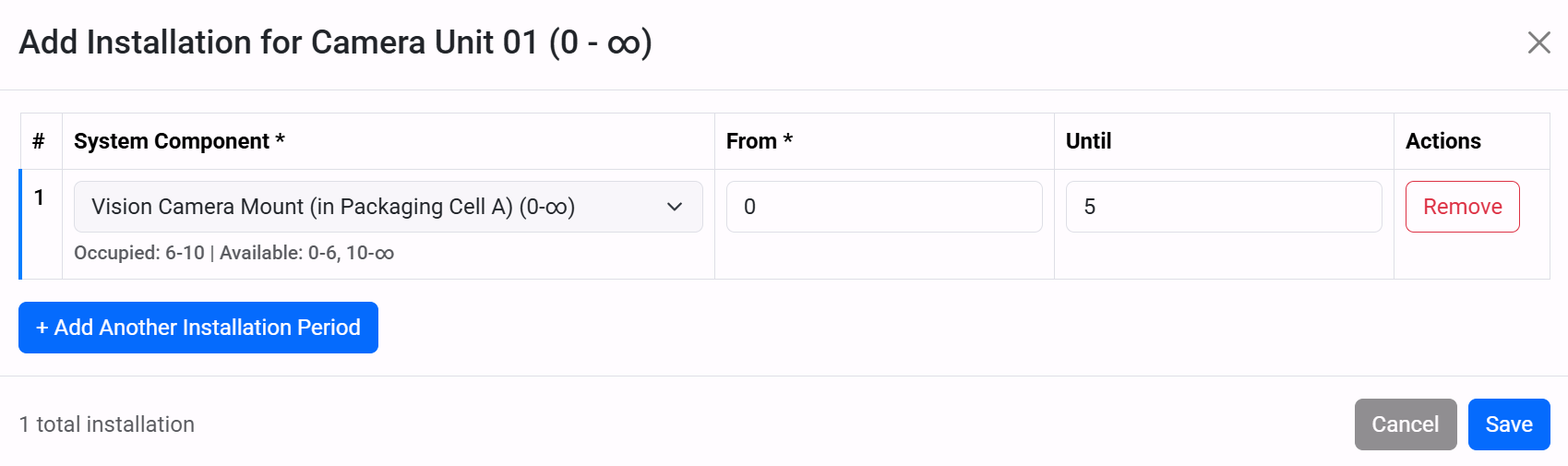
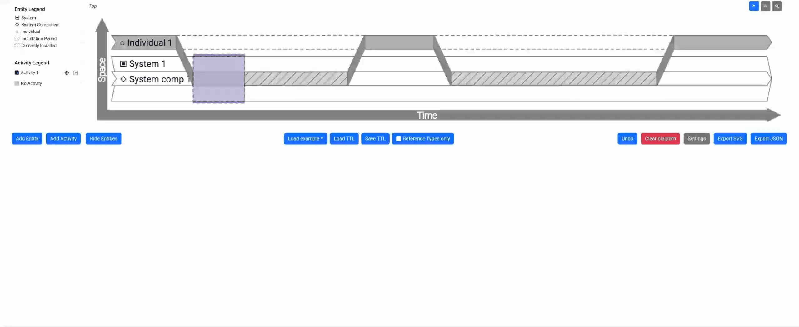
When editing an Individual, an Installations card shows the current installation count and a button to open the Installations modal. An installation fuses an individual into a system component slot for a specified time range.
Inside the modal, each row contains:
- System Component - a dropdown listing every component, labelled with its parent system and bounds.
- From / Until - numeric fields for the installation start and end times.
- Availability - beneath the component dropdown, an indicator shows which time ranges in the selected slot are already occupied and which are available.
Use Add Another to create additional rows. The editor enforces several rules: installations must stay within both the individual's and the component's bounds, the ending must be after the beginning, and two different individuals cannot occupy the same slot at the same time.
For a worked example of creating installations, see the System Component Example.
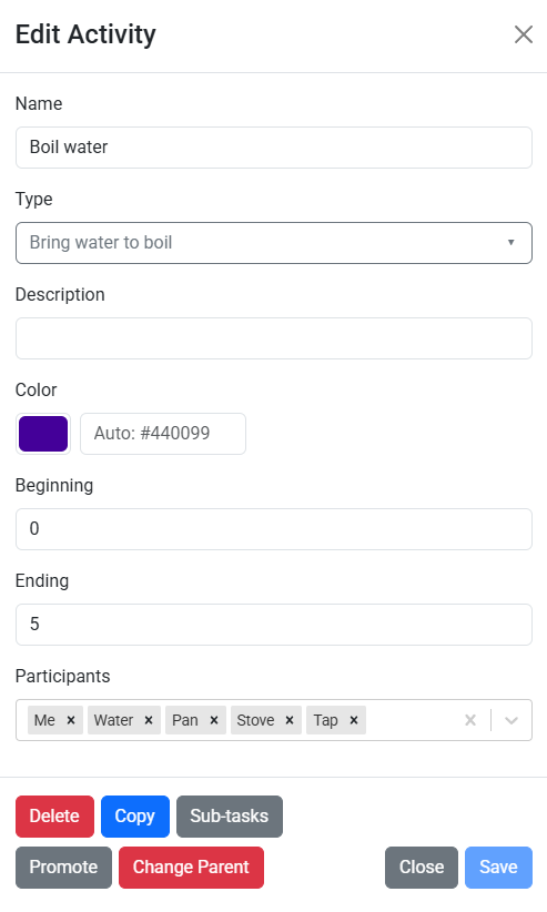
Adding Activities
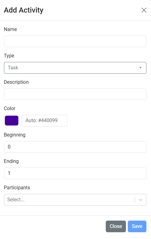
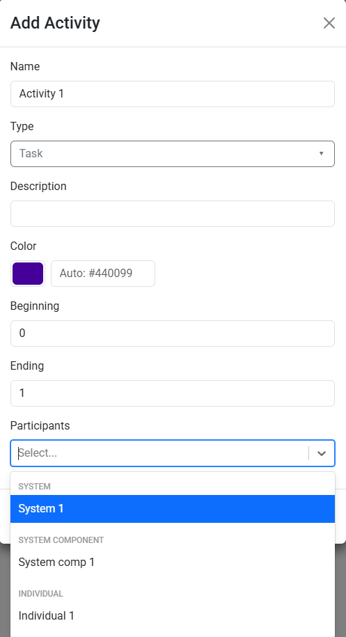
Activities are the temporal blocks in your model. Use Add Activity to set name, start/end time, and participants. Activities can overlap and are shown as colored blocks on the timeline.
Adding Participations
Participations link entities to activities. In the activity editor, tick entities to include them, and untick to remove the link. This updates the diagram instantly.
Picking Activity Color
You can choose an activity color during creation or editing. The selected color is reflected on the activity block, participation shading, and activity legend.
Color priority works like this: if an activity has its own custom color, that custom value is used first. If no custom activity color is set, the editor uses the current Activity Fills palette from Diagram Settings based on the activity's position.

Breaking Down Activities
Use sub-tasks to decompose larger activities into detailed steps. Open an activity, then use Sub-tasks to create and navigate a child diagram.
This helps uncover missing participants and decision points. Breadcrumbs at the top make it easy to return to parent or top-level diagrams.
Affected Items Warnings
If an edit or delete would affect related items, the editor opens an affected-items dialog before anything is applied. The dialog only lists the items touched by that change, so you can review the knock-on effects before saving.
The core sections are the same for Individuals, Systems, and System Components: bounds changes, installation periods, and participations in activities. When the edited entity is a System, the dialog can also list affected System Components inside that system.
Required deletions are shown with disabled checkboxes. Optional items have interactive checkboxes so you can accept the proposed result or switch the outcome before saving. Activity-level annotations show whether an activity will be removed entirely, trimmed to the remaining participants, or left unchanged.
Activity headers can also show note markers. A '#' marker means the activity itself will be removed because no participants remain. A '*' marker means the activity itself will be trimmed to the remaining participation bounds.
The footer legend and any notes are conditional. Each legend item only appears when that action is present in the current modal, and the notes section only appears when there is an extra outcome to explain.
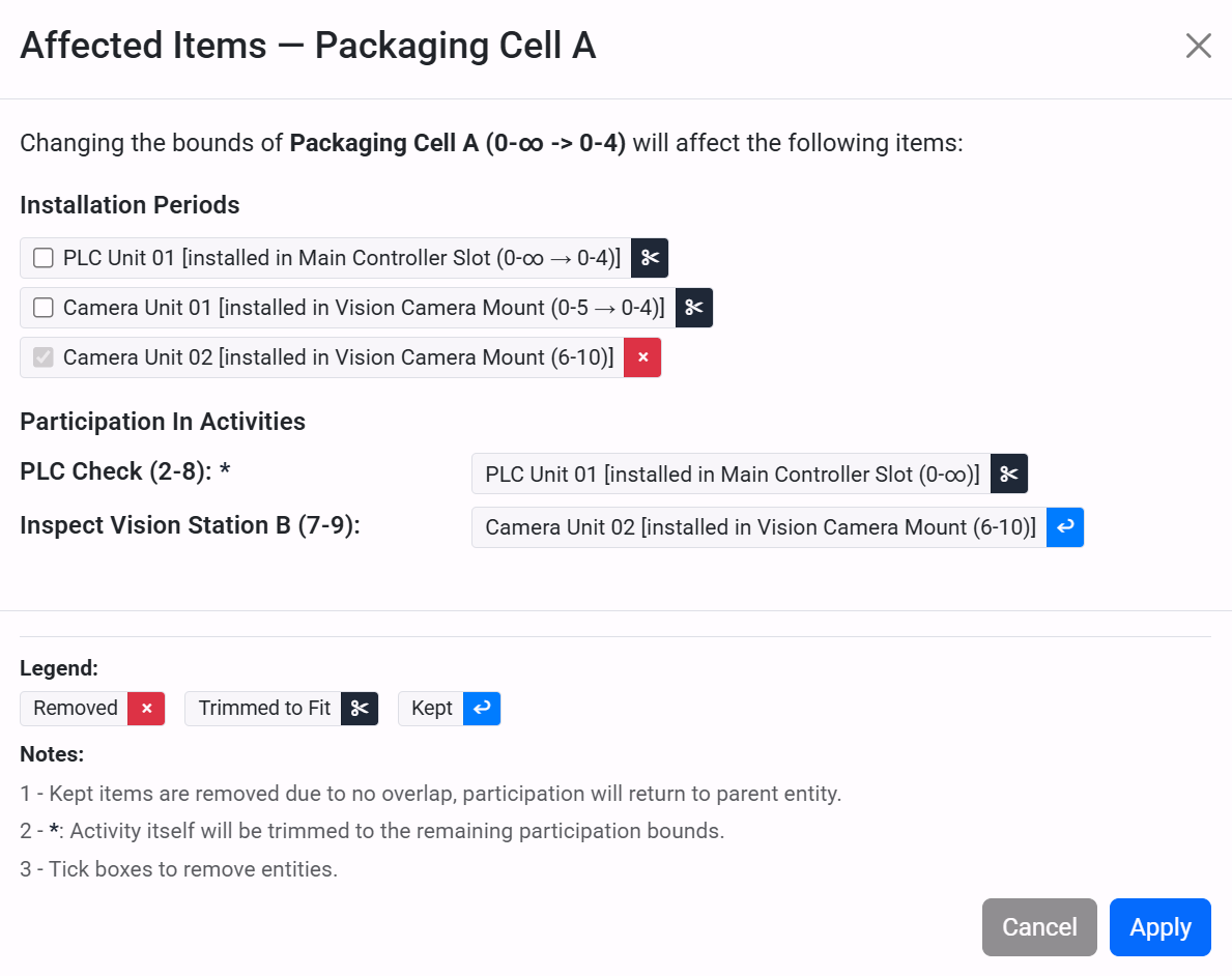
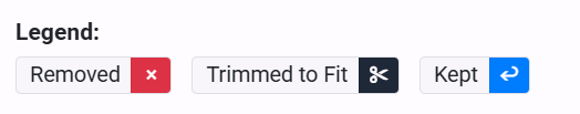
Trim, Remove and Keep
Both warning dialogs use three colour-coded action badges to communicate the outcome for each item:
- Removed - the item has no overlap with the new bounds and will be deleted.
- Trimmed to Fit - the item partially overlaps and will be shortened to stay within the new bounds.
- Kept - the installed participation itself is removed due to no overlap, but the participation returns to the parent entity instead of being deleted outright.
You can click a Trimmed badge to upgrade it to Removed if you would rather delete the item outright. Conversely, unchecking a toggled badge reverts it to trim. This gives you fine-grained control over exactly which items survive the edit.
Once you are happy with the selections, use the action button to apply the change. For edits this is Apply; for deletions it uses a delete label that includes the entity name. The affected installations, participations and activities are updated (or removed) in a single step, and the resulting change is recorded as one entry in the undo history.
File Management and Exporting
Session Auto-Saving
Any changes made to your diagram and settings during your session are automatically saved in the background. You can safely navigate through other pages of the website, and your diagram will persist when you return to the editor. However, these changes will be lost when you completely close the browser tab or window unless you explicitly save them.
Turtle Files
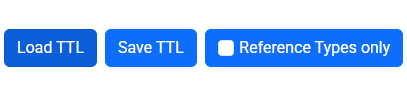
Diagrams can be saved to your local computer in a format called ‘Turtle’. (This is a format used by the RDF data modelling community.) The ‘Save TTL’ and ‘Load TTL’ buttons can be used for this.
The ‘Reference Types only’ switch arranges for save and load to ignore any individuals or activities present in the diagram or in the file being loaded. Instead, the buttons will just save or load types you have defined (types of individual, activity or participant). This makes it possible to start building up libraries of types which can be reused across diagrams.
Loading an example
Some examples are provided to make it easier to get started. These can be accessed from the ‘Load example’ dropdown.
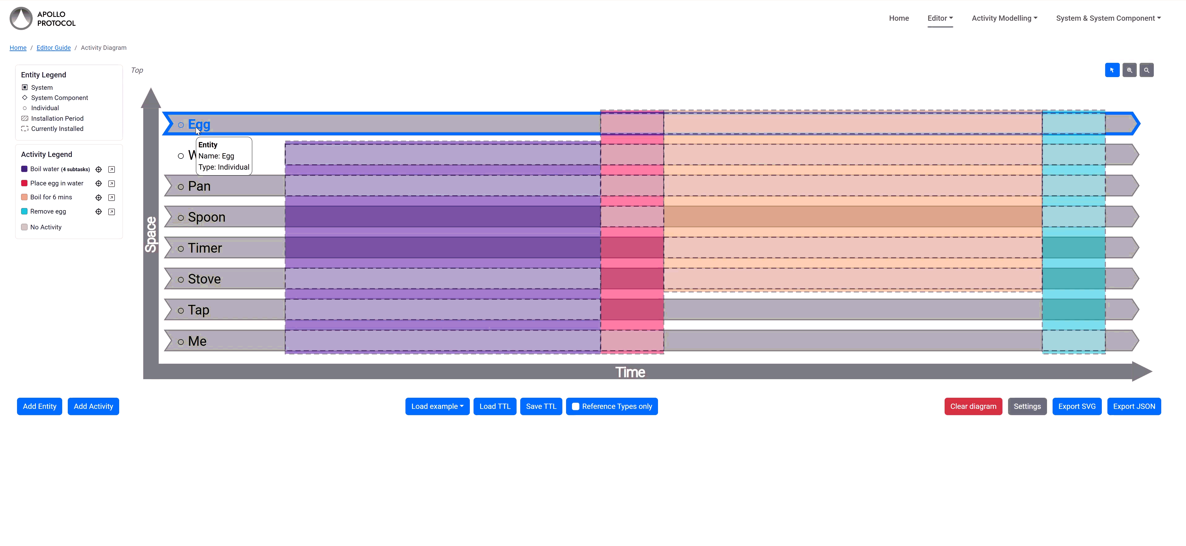
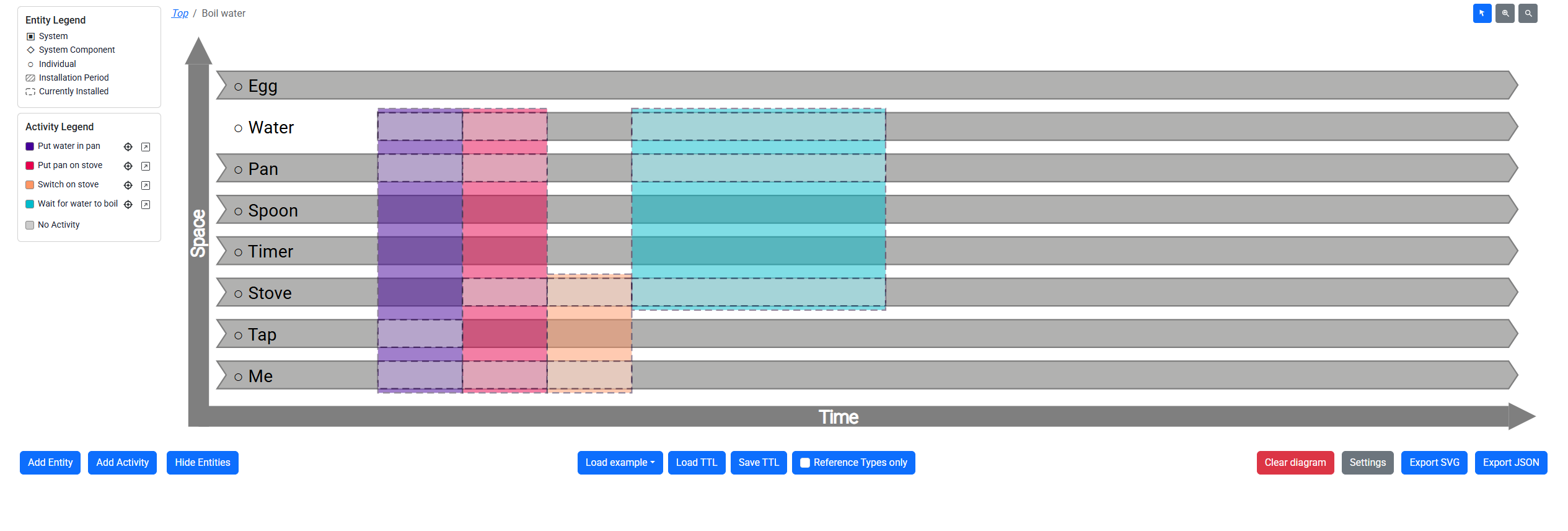
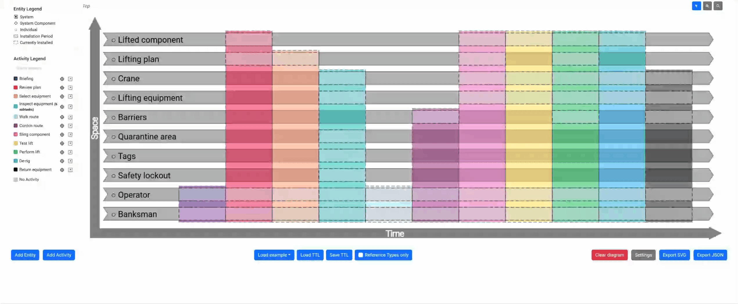
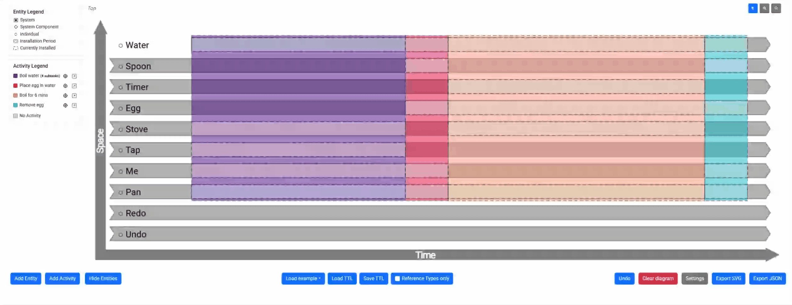
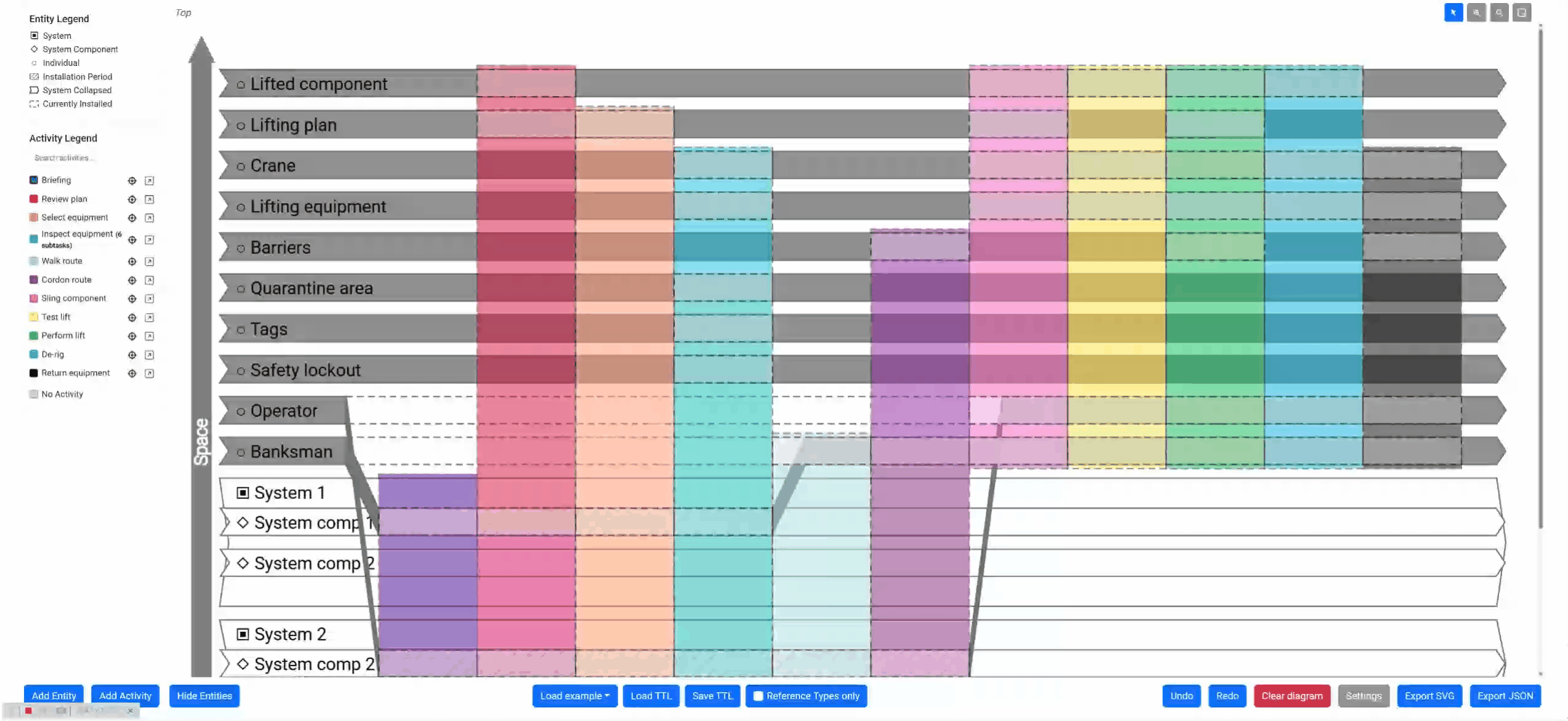
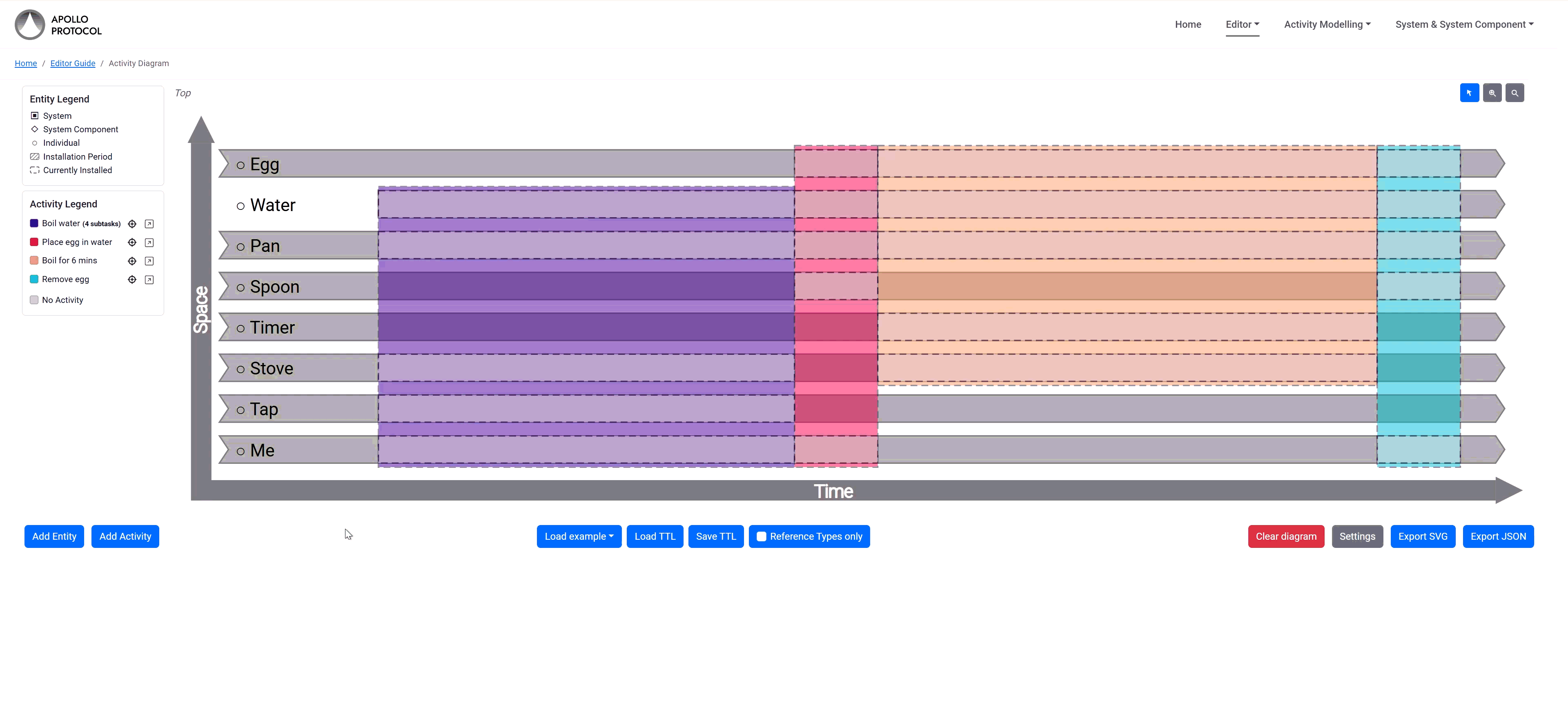
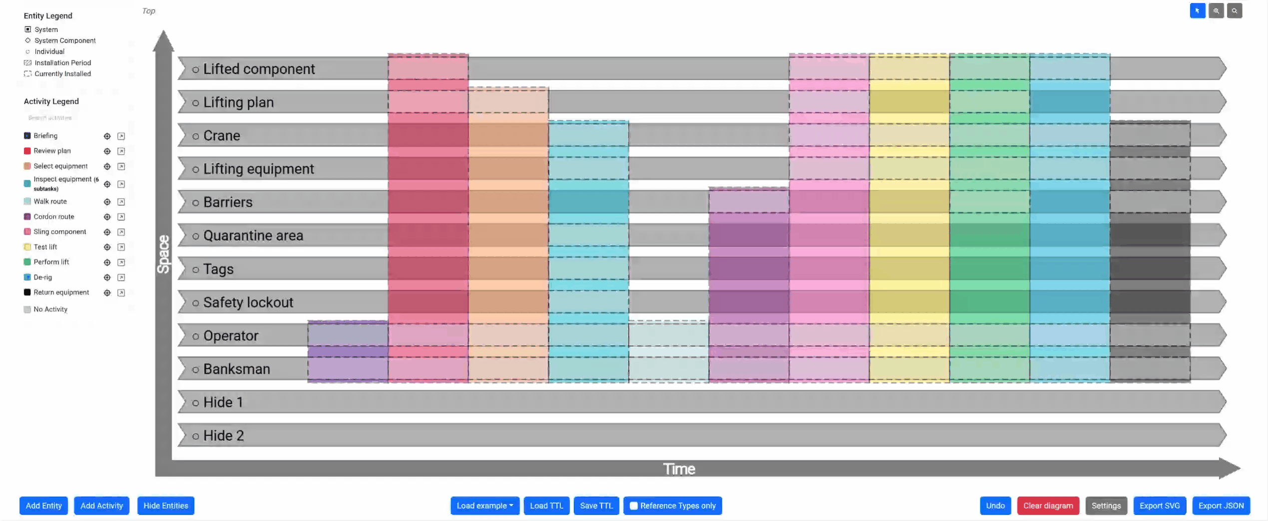
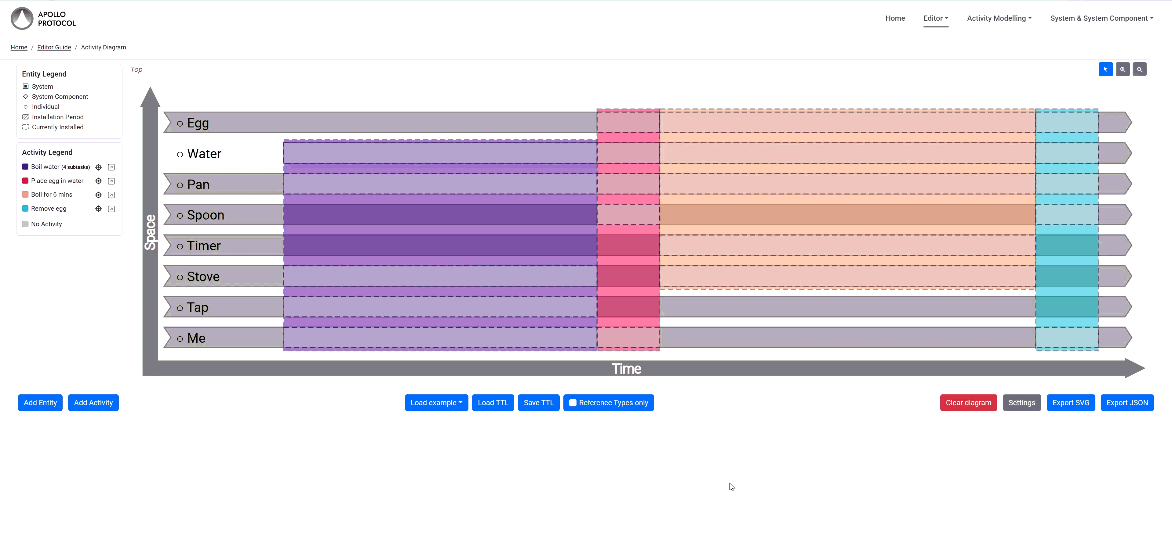
The ‘boil an egg’ example is relatively simple, if perhaps analysed to a rather excessive level of detail. The ‘crane lift’ example is the full diagram from the example analysis. The ‘packaging cell’ example provides a complete system hierarchy showing equipment swap-outs over time, which accompanies the system and system component analysis.
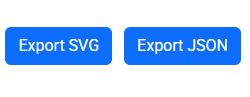
Exporting other File Formats
The editor can export your diagram as an SVG, for inclusion as an image in documents. There are various tools available which will convert the SVG into other picture formats if you need that.
The editor will also export the data backing the diagram as JSON-LD; this may be easier to process from other tools than the Turtle file format. Currently the JSON produced is not very friendly to process with tools that don't understand RDF; this may be changed in the future. For now don't rely on the JSON schema, but ensure the JSON is processed as JSON-LD.
Interface Reference
Navigation
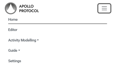
The fixed top navigation bar provides quick access to every part of the application. From left to right it contains:
- Home - returns to the landing page.
- Editor - opens the interactive diagram editor.
- Activity Modelling (dropdown) - links to the Introduction, the Example Analysis (crane lift walkthrough) and Integrated Information Management.
- Guide (dropdown) - links to this Editor Guide and the Terminology reference. Below a divider, a System & System Components sub-section links to the system modelling Introduction and Example Analysis.
- Settings (button) - opens the settings modal described below.

On small screens the navbar collapses to a hamburger menu. Dropdown items and the active-page highlight work the same way in the collapsed view.
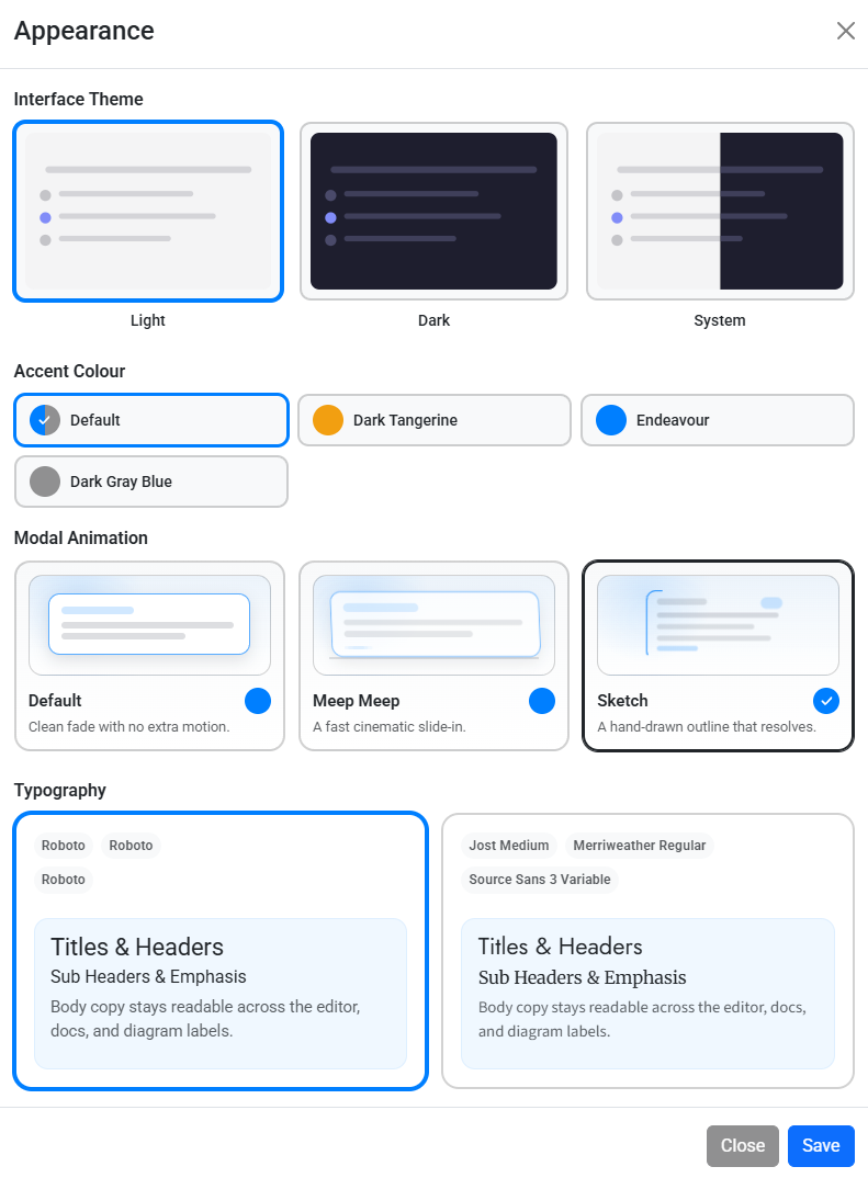
Settings
The Settings button in the navbar opens the editor-wide appearance modal. This is where you configure the application chrome rather than the diagram itself.
- Theme - choose Light, Dark, or System.
- Accent - use the default profile or switch to one of the preset accent colours for links, highlights, and buttons.
- Typography - choose the default Roboto-based profile or the Apollo Forum profile with Jost, Merriweather, and Source Sans 3.
- Modal Animation - choose Default, Meep Meep, or Sketch for dialog transitions.
These settings are stored in local storage, so the editor restores them the next time you open the app.
Modal Behaviour
All dialog modals in the editor including the entity editor, activity editor, warnings, settings, and the search popover are draggable. Click and hold the header bar of any modal and drag it to a new position so it does not obscure the part of the diagram you are working on.
Modal animation is configured from the Settings subsection above, and the selected style is applied consistently across the editor.
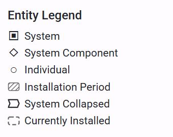
Entity Legend
The Entity Legend is a static reference panel that explains the symbols used on the diagram. It shows six indicators:
- System (filled square) - a structured assembly
- System Component (diamond) - a slot within a system
- Individual (circle) - a standalone entity
- Installation Period (hatched rectangle) - the time range an individual is fused with a component
- System Collapsed (square with cut corners) - a system that is currently collapsed to hide its components
- Currently Installed (dashed rectangle) - a currently active installation
The Entity Legend is for reference only; it is not interactive.
System Collapse
When a system contains one or more system components, you can right-click the system's row on the diagram to collapse it. Collapsing hides all of the system's components and replaces them with a single compact row showing the system name. Right-click again to expand.
Collapsed systems are fully supported across the editor: search results and minimap clicks correctly highlight the parent system row, and the SVG export reflects the current collapsed/expanded state including a “System Collapsed” entry in the legend.
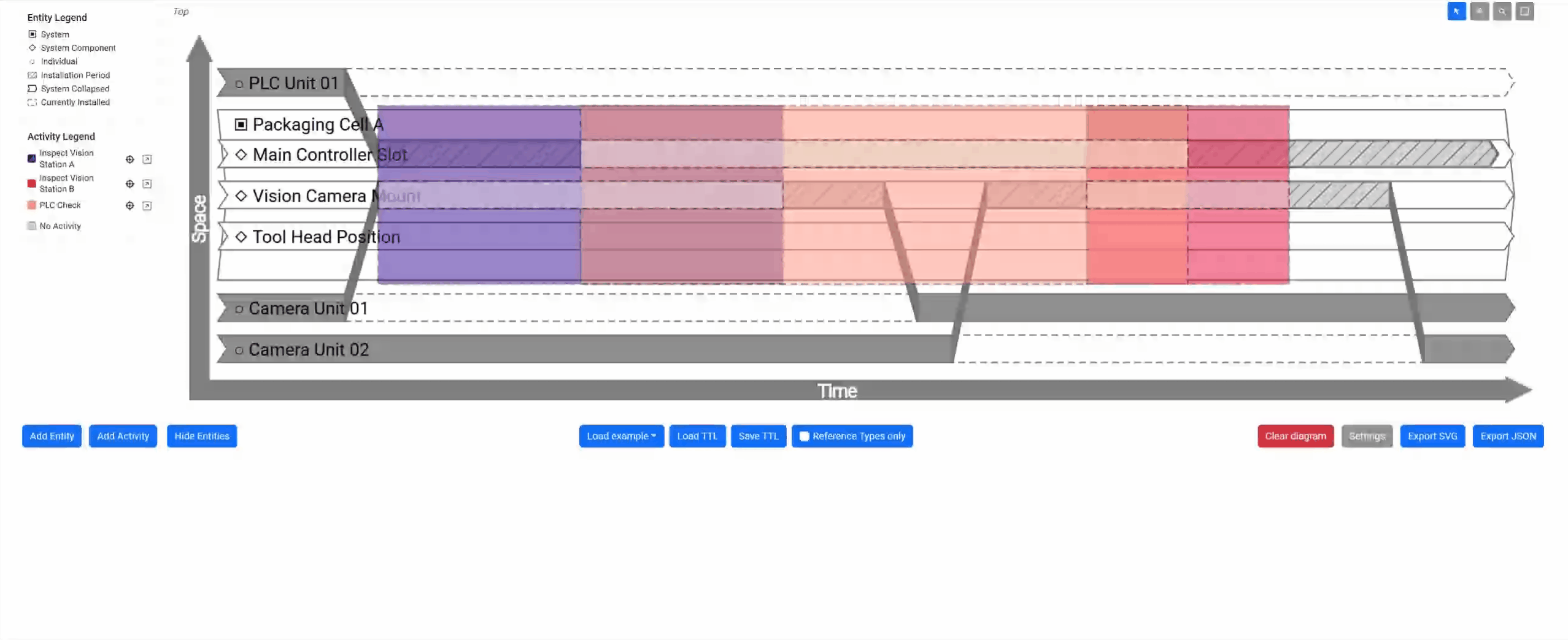
Activity Legend
The Activity Legend sits alongside the diagram and lists all activities. Each entry shows the activity name and its assigned colour. If an activity has sub-tasks, the count is shown next to the name. When there are more than five activities, a search box appears at the top of the legend for quick filtering.
Each legend entry has two action buttons: the target icon highlights the activity on the diagram (see Highlighting Activity), and the arrow icon opens the activity editor (see Editing Activity). As you add or remove activities, the legend updates live.
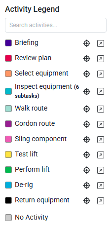
Highlighting Activity
To highlight an activity, click the target icon next to the activity's entry in the Activity Legend. The selected activity is rendered at full opacity while every other element dims, visually isolating the activity and all of its participations. This makes it straightforward to see exactly which entities are involved and how the activity sits in relation to the overall timeline.
To remove the highlight, click the same target icon again. Note that clicking directly on an activity block on the diagram opens the activity editor rather than highlighting it.

Editing Activity
Click the arrow icon next to any activity in the Activity Legend (or click the activity block) to open the activity editor. You can update name, time bounds, type, color, and participating entities.
The editor also supports copying and deleting activities. Changes apply to the diagram immediately, so you can iterate quickly.
When time bounds edits have cascade effects, the editor shows an affected-items warning before applying the change. For example, tightening a system timeline can trim installation endings, trim participation timing, and in some cases remove an activity that no longer has valid participation - and the warning dialog lets you review and adjust every one of these outcomes before confirming.
Zoom
Three small buttons appear in the top-right corner of the diagram area: a pointer, a zoom icon, and a search icon. To zoom, click the zoom button to enter zoom mode. You can then use the mouse wheel or pinch gestures to scale the diagram in or out, and click-drag to pan. To return to normal interaction, click the pointer button.
The zoom range runs from 0.5× to 4× magnification. Zooming adjusts the spacing of the time axis, keeping entity rows the same height so labels remain readable.
To reset the zoom back to the normal level, right-click on the zoom icon.
Search Entity
When a model contains dozens of entities, scrolling through all the rows can be slow. Click the search icon in the top-right corner of the diagram to open a compact popover with a text input. As you type, the list filters down to entities whose names match. Clicking a result scrolls the diagram to centre on that entity's row and briefly flashes it to draw your attention.
To ensure a clear view of your workspace, the search popover (as well as all dialog modals in the editor) is entirely draggable. You can click and hold the top handle of the search wrapper or the header of any modal to move it out of the way of your active diagram elements.
From the search results you can also rename an entity inline: click the pencil icon next to a result, type the new name and confirm. The diagram updates instantly.
Minimap
The minimap provides a birds-eye overview of the entire diagram. Toggle it with the minimap button in the top-right toolbar. It is hidden by default and appears as a floating panel that can be dragged to any position. Use the −, reset and + controls on the minimap header to resize it.
Hovering over the minimap activates a magnifier lens that shows a zoomed-in view of the area under your cursor. The lens automatically repositions itself to stay within the minimap panel. Clicking on an entity in the minimap scrolls the main diagram to that entity and briefly highlights it.
The blue viewport rectangle shows which portion of the diagram is currently visible. Drag it to pan the main diagram view.
Undo, Redo and Clear Diagram
Every change you make to the model (adding, editing or deleting entities, activities and participations) is recorded in an internal history stack. There is an Undo button on the right-hand side; this will undo the most recent change you have made. Press Redo to reapply an undone change.
Right-click either the Undo or Redo button to open a history table that shows every recorded change. The table spells out both the original edit and the exact action available in that row, so each entry clearly describes what changed and what Undo or Redo will do next. Use the Undo to Here or Redo to Here action button in the row to jump directly to that point in history, skipping multiple steps at once.
Each row shows the action label (Will Undo or Will Redo), the Category, the Recorded Change, and the row's Position in the current stack.
The undo history keeps up to 50 steps; the button disappears when you can't undo any more changes. Once a new change is made after an undo, the redo stack for the previous forward path is cleared.
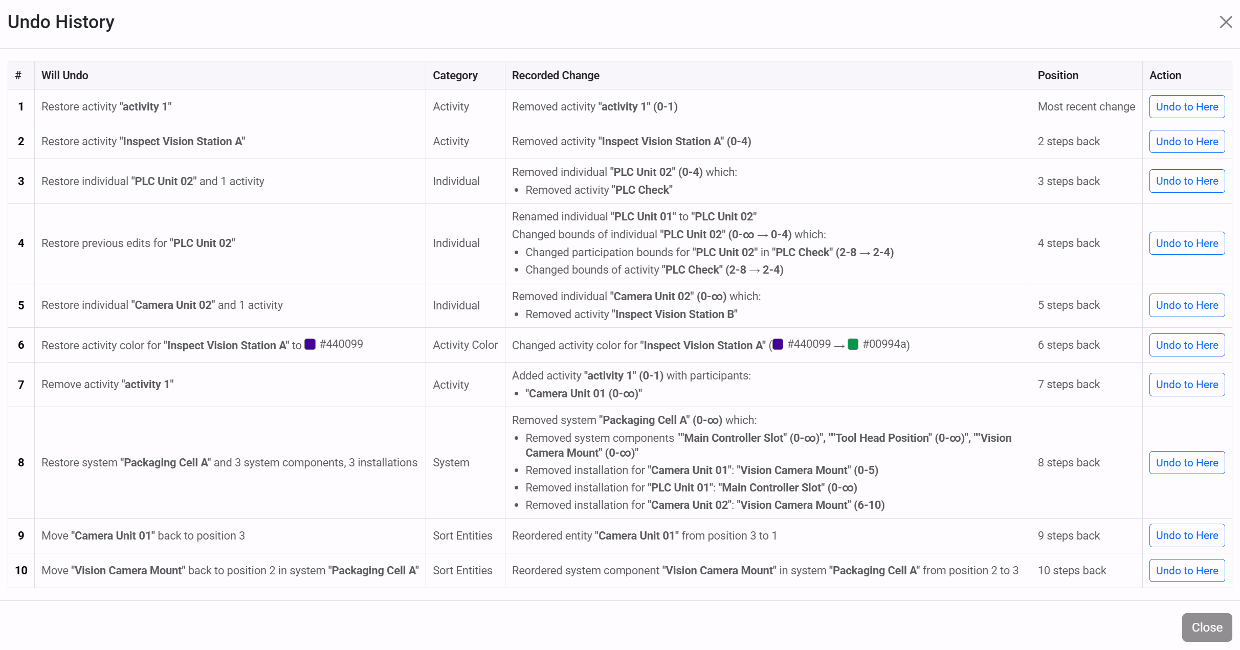
The Clear diagram button will start again with a completely clean diagram. Clearing is now part of the undo history, so you can use Undo to restore the diagram immediately after a clear, or Redo to apply the clear again.
Hide Entities
Large diagrams can become visually cluttered. If any entities do not participate in an activity, a Hide Entities button appears in the toolbar. Clicking it hides all non-participating entity rows from the diagram, allowing you to focus on the active parts of the model. Click the button again (now labelled Show Entities) to reveal them.
Hidden entities still exist in the underlying data. Entities that are part of a system hierarchy (for example a component of a system) will not be hidden even if they have no direct participation, because the parent-child relationship keeps them visible.
Sorting by Dragging
The order of entity rows on the vertical axis is fully customisable. In the entity list panel, grab the drag handle on any row and move it up or down to reposition it. The diagram re-renders in real time as you drag, so you can see the effect immediately.
This manual sorting is helpful when you want logically related entities (e.g. all personnel, or all equipment in one system) to appear next to each other on the diagram for clarity.
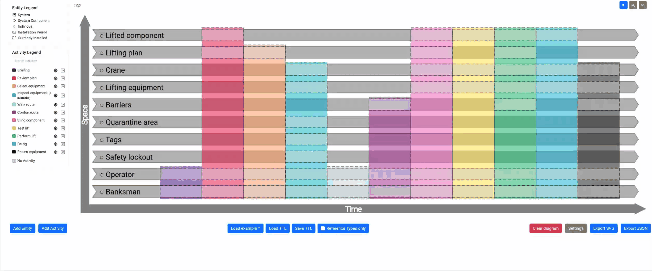
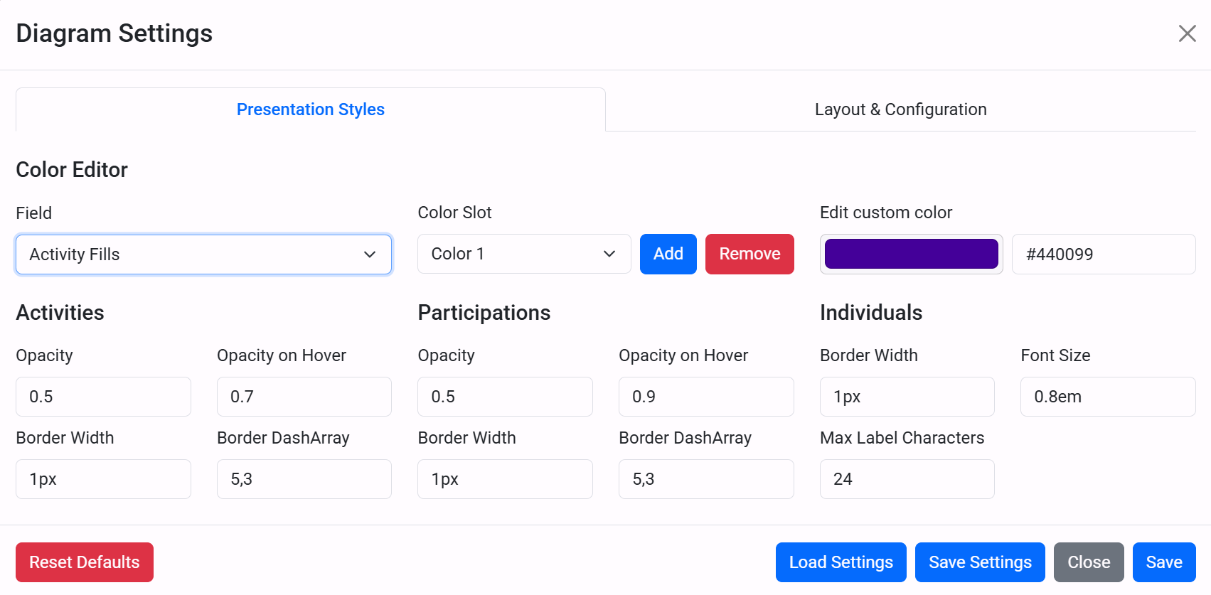
Diagram Settings
The Settings button controls how the diagram itself is displayed. These options affect layout, dimensions, labels, colours, and other presentation choices used when the diagram is drawn.
Changes are applied when you press Save. At the bottom of the dialog you can also Reset Defaults, Save Settingsto a local file, or Load Settings from a file you saved earlier.
Presentation Styles
The Presentation Styles tab controls the visual appearance of diagram elements. At the top of this tab there is a shared Color Editor that lets you update all color fields without showing a separate color picker for each setting.
- Use Field to choose which color property to edit. Options are grouped by type (Individuals, Activities, Participations, and Axis).
- For activity color lists, use Color Slot to select a list entry, then use the Add and Remove buttons to manage slots.
- Use Custom Color to pick via the color picker button or type a hex value directly (for example,
#981f92).
Below the Color Editor, the rest of the tab is split into three sections:
- Activities:
- Opacity: Base transparency of activity blocks.
- Opacity on Hover: Transparency used when hovering an activity.
- Border Width: Stroke thickness around activity blocks.
- Border DashArray: Dash pattern used for activity borders (for example
5,3).
- Participations:
- Opacity: Base transparency for participation overlays.
- Opacity on Hover: Transparency used when hovering participations.
- Border Width: Stroke thickness around participation shapes.
- Border DashArray: Dash pattern used for participation borders.
- Individuals:
- Border Width: Stroke thickness around individual rows.
- Font Size: Size of individual name labels.
- Max Label Characters: Maximum number of visible characters before label truncation.
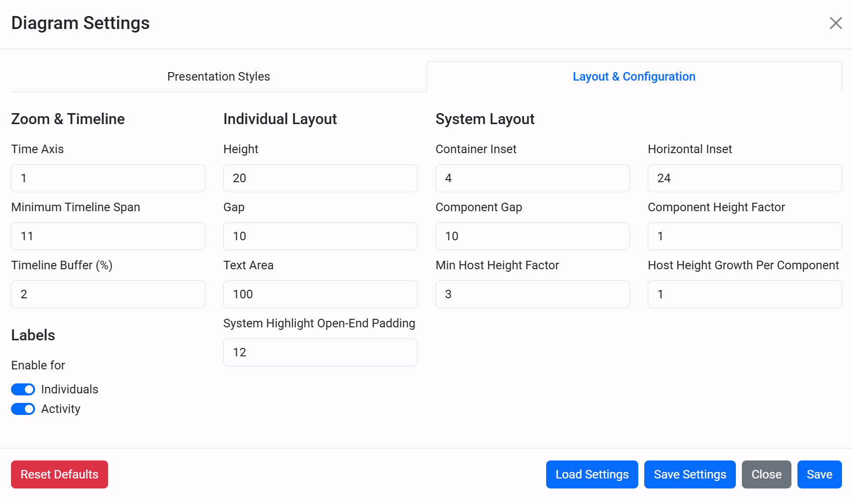
Layout & Configuration
The Layout & Configuration tab controls dimensions, spacing and behavioural options:
- Zoom & Timeline:
- Time Axis: The horizontal scale/magnification of the timeline.
- Minimum Timeline Span: The lowest number of time units the diagram will display by default, ensuring very short models still have breathing room.
- Timeline Buffer (%): The percentage of padding added to the start and end of the bounds so elements do not sit flush against the edges of the screen.
- Individual Layout:
- Height: The vertical thickness of the individual rows on the diagram.
- Gap: The empty vertical space between adjacent individual rows.
- Text Area: The width of the left-hand column reserved for entity names/labels.
- System Highlight Open-End Padding: Extra visual space applied when an entity's beginning or ending time is unknown (open chevron).
- System Layout:
- Container Inset: The vertical padding inside a System border containing its internal components.
- Horizontal Inset: The horizontal padding inside a System's time boundaries.
- Component Gap: The vertical gap specifically between System Components.
- Component Height Factor: How much taller a System Component row is relative to a standard individual row.
- Min Host Height Factor: The minimum vertical height of a parent system relative to a single individual row.
- Host Height Growth Per Component: How much extra vertical space is added to the system enclosure for each component installed inside it.
- Labels: Global toggles to enable or hide labels for individuals and activities entirely.